Customizing UI
As mentioned in the Customizing Schema guide, you can specify custom item renderers in your schema to control how fields are displayed in the Flowformer studio. This guide explains how to create custom item renderers for your app.
Declaring the renderer in the schema
Let's say you want to customize how slides in the Presentation model are displayed in the Flowformer UI. You can do this by adding a @itemRenderer directive to the slides field in your schema.
model Presentation @entry {
    title String? @description("The title of the presentation")
    slides PresentationSlide[]
        @description("The slides in the presentation.")
        @itemRenderer("PresentationSlide") // <-- This tells Flowformer to use the PresentationSlide component to display the slides
}
This directive tells the Flowformer studio to use the PresentationSlide component to display the items of the slides array field.
Now if you navigate to src/main.ts in your app, you can see the PresentationSlide component is registered by default.
import { registerRemoteUi } from "@flowformer/remote-react-ui";
import { RendererToDataTypes } from "./generated/types";

// The default renderer for PresentationSlide added by the create-app CLI
import { PresentationSlide } from "./components/PresentationSlide";

registerRemoteUi<RendererToDataTypes>({
  PresentationSlide,
  // ... Register more components here
});
React component for the custom item renderer
To create a custom item renderer, you need to create a React component that will be used to render the items of the field. The component should accept a data prop that contains the data to be rendered. Type of the data prop will match the type of the field in the schema.
We generate TypeScript types for each model in your schema. You can find the generated types in the src/generated/types.ts file. You can use these types to define the props for your custom item renderer.
Please note that you cannot use HTML tags in the component. Instead, use the
components provided by @flowformer/remote-react-ui to create your UI.
Here's an example of a custom item renderer for the PresentationSlide model:
import {
  BlockStack,
  Box,
  Icon,
  Image,
  InlineStack,
  List,
  ListItem,
  Text,
} from "@flowformer/remote-react-ui";
import { PresentationSlide as PresentationSlideData } from "../generated/types";

export const PresentationSlide = ({
  data,
}: {
  data: PresentationSlideData;
}) => {
  let content: JSX.Element;

  if (data.$type === "BulletPointSlide") {
    content = (
      <BlockStack gap="lg" fillWidth fillHeight align="center" justify="center">
        <Text variant="headingLg">{data.title}</Text>
        <List style={{ margin: "20px 0 0 0" }}>
          {data.bulletPoints.map((bulletPoint, index) => (
            <ListItem key={index}>{bulletPoint}</ListItem>
          ))}
        </List>
      </BlockStack>
    );
  } else if (data.$type === "SingleImageSlide") {
    content = (
      <BlockStack gap="lg" fillWidth fillHeight align="center" justify="center">
        <Text variant="headingLg">{data.title}</Text>
        {data.generatedImage.status === "success" ? (
          <Image
            alt={data.queryForImage}
            src={data.generatedImage.data!}
            style={{ width: 320, height: 320 }}
          />
        ) : (
          <Box color="gray" style={{ color: "#333", width: 320, height: 320 }}>
            {data.queryForImage}
          </Box>
        )}
      </BlockStack>
    );
  } else {
    content = (
      <BlockStack gap="lg" fillWidth fillHeight align="center" justify="center">
        <Text variant="headingLg">{data.title}</Text>
      </BlockStack>
    );
  }

  return (
    <Box color="black" style={{ width: 800, height: 600, color: "white" }}>
      {content}
      <Box
        color="white"
        position="absolute"
        padding="md"
        style={{
          bottom: 20,
          left: 20,
          right: 20,
          backgroundColor: "rgba(39, 60, 117, 0.5)",
        }}
      >
        <InlineStack gap="sm">
          <Icon icon="AudioLines" />
          <Text>{data.narration}</Text>
        </InlineStack>
      </Box>
    </Box>
  );
};
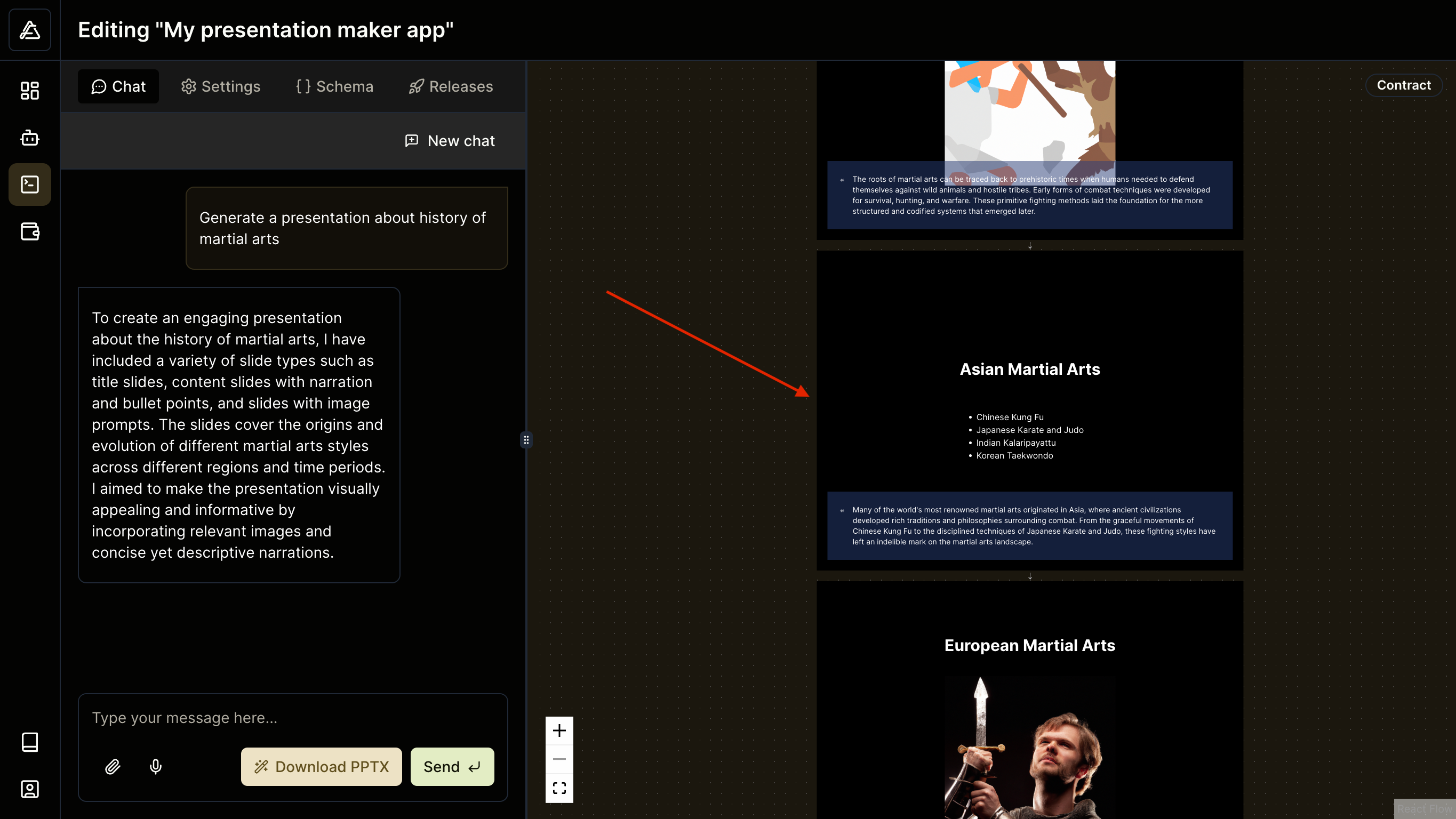
The component above will tell Flowformer how to render the PresentationSlide items in the UI. The result will look like this:
